Spotify Analytics
Overview
Spotify Analytics is currently in Beta and is available to a select group of growing labels and artists. Access will be gradually expanded to more users over the coming weeks.
Analytics data is updated weekly, giving you a clear overview of your Spotify performance through an easy-to-use dashboard.
The Analytics page displays near-real-time performance data for your catalog, including streams by song, artist, and label, along with performance trends over time.
Note: Analytics figures may differ from your Royalty Reports. Some DSPs (including Spotify, Apple Music, YouTube, Deezer, and others) report both royalty-bearing and non-royalty-bearing streams in their analytics data. Non-royalty-bearing streams reflect audience engagement but do not generate revenue, so they will not appear in your Royalty Reports.
Step 1: Open Analytics
From the left sidebar, navigate to:
Tools → Analytics
Step 2: Select a Store
Use the Select Store dropdown to choose the streaming platform you want to analyze (for example, Spotify).
Step 3: Select a Date Range
Use the Select Date dropdown to choose the period you want to analyze.
You can also select up to five date ranges simultaneously to compare performance across multiple periods (see Step 8).
Step 4: Choose a View
Use the tabs at the top of the page to change how your data is grouped.
- Songs — Performance grouped by individual tracks.
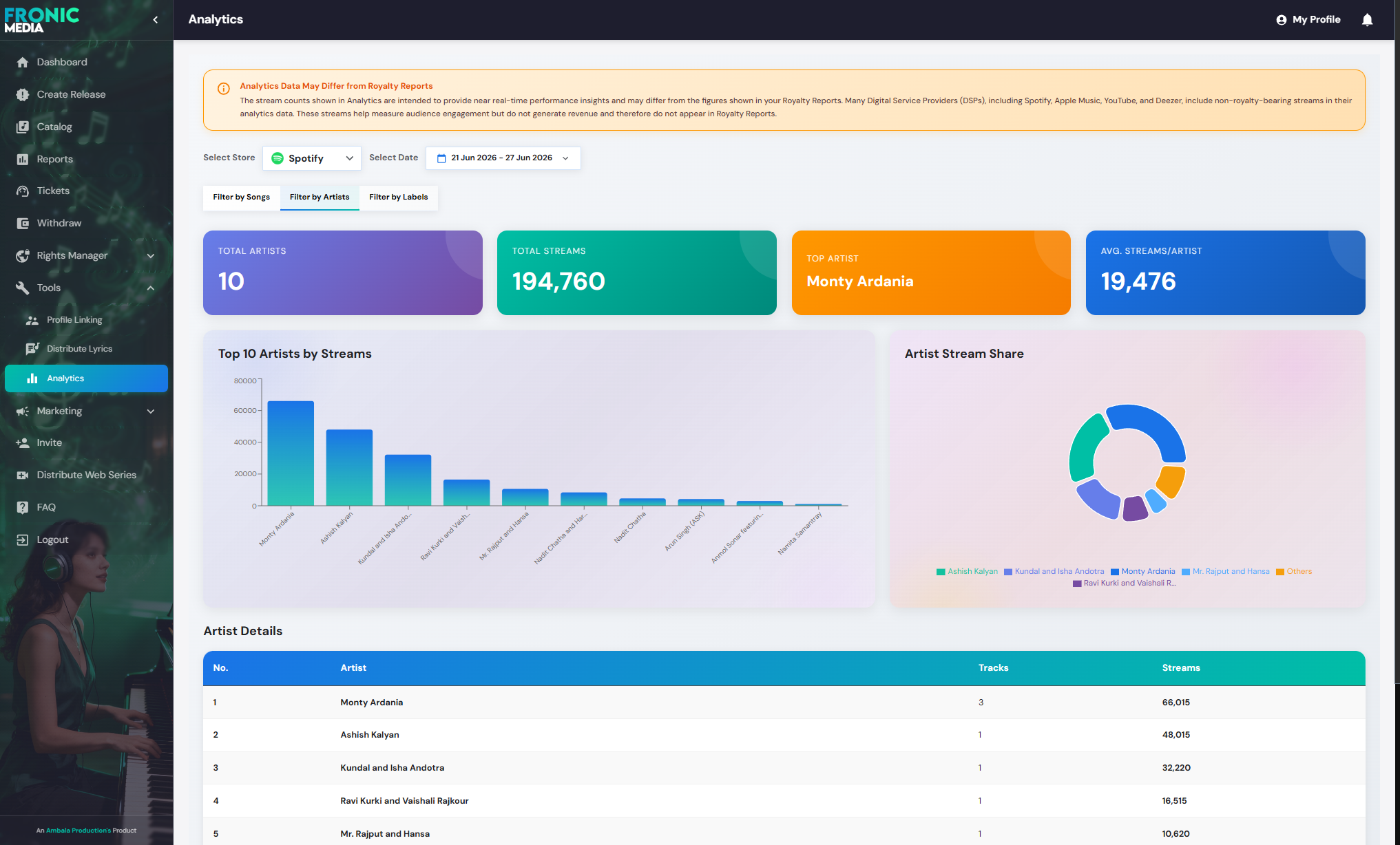
- Artists — Performance grouped by artist.
- Labels — Performance grouped by label.
Each tab displays the same analytics dashboard, with only the grouping changing.
Step 5: Review the Summary Cards
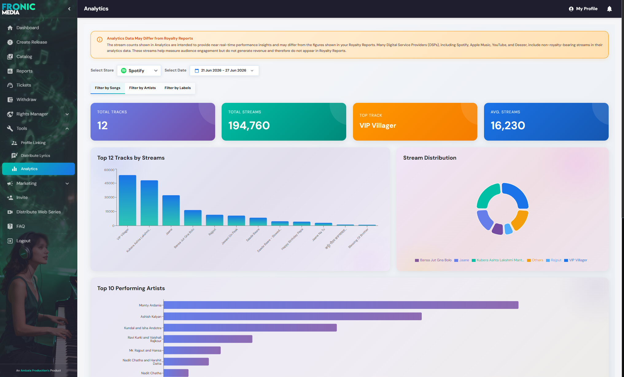
At the top of each view, you’ll find four summary cards that provide a quick snapshot of performance.
| Card | Description |
|---|---|
| Total Tracks / Artists / Labels | Number of items that received streams during the selected period. |
| Total Streams | Total streams generated during the selected period. |
| Top Track / Artist / Label | Best-performing item based on total streams. |
| Average Streams | Average number of streams per item in the selected view. |
Step 6: Analyze the Bar Chart
The bar chart ranks the top-performing items (typically the top 10–12) by stream count, making it easy to identify your strongest performers.
Step 7: View Stream Distribution
The donut chart shows how total streams are distributed among the top-performing tracks, artists, or labels.
A legend beneath the chart displays the exact share for each item.
Step 8: Compare Multiple Time Periods (Optional)
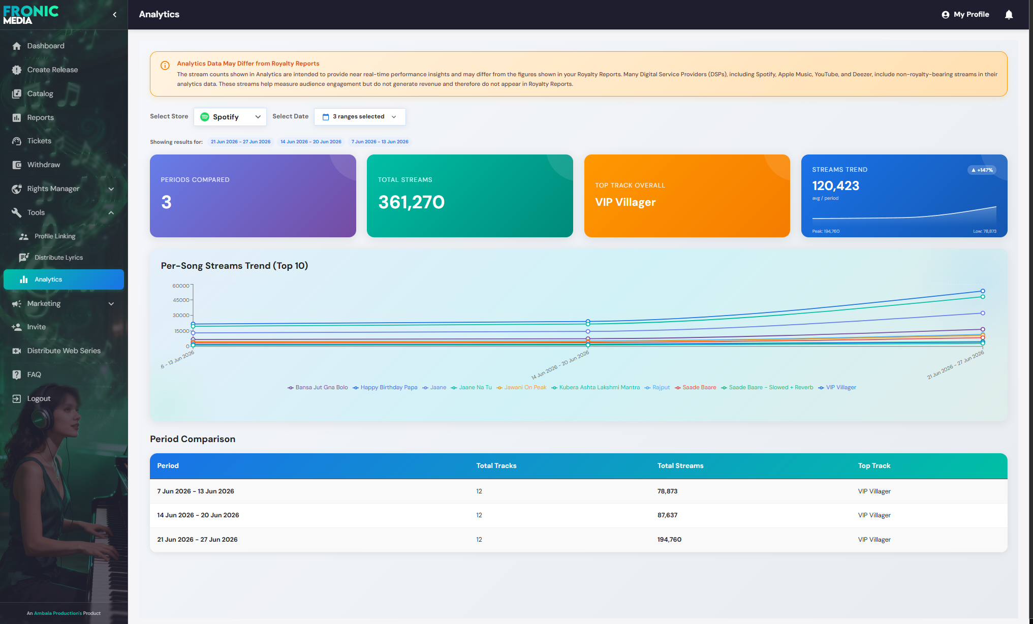
Selecting more than one date range enables the comparison view.
This includes:
- Line Chart – Displays stream trends for each selected period, allowing you to compare performance over time.
- Period Comparison Table – Summarizes each selected period with:
- Total Tracks
- Total Streams
- Top Performing Track
This helps you quickly determine whether your catalog is gaining or losing momentum.
Step 9: Review Detailed Statistics
Scroll down to the Details table.
Depending on the selected tab, you’ll see:
- Track Details
- Artist Details
- Label Details
The table provides exact stream counts for every item, making it useful when you need precise figures beyond the visual charts.
Tips
- Your selected Store and Date Range remain unchanged when switching between the Songs, Artists, and Labels tabs.
- Use the comparison feature to evaluate how new releases perform over time instead of relying on a single reporting period.